Bandeins Strange is a simple, geometric sans-serif typeface which combines typical geometric characteristics with a slightly curvy character, inspired by early grotesque fonts from the 19th century, but with a modern appearance.
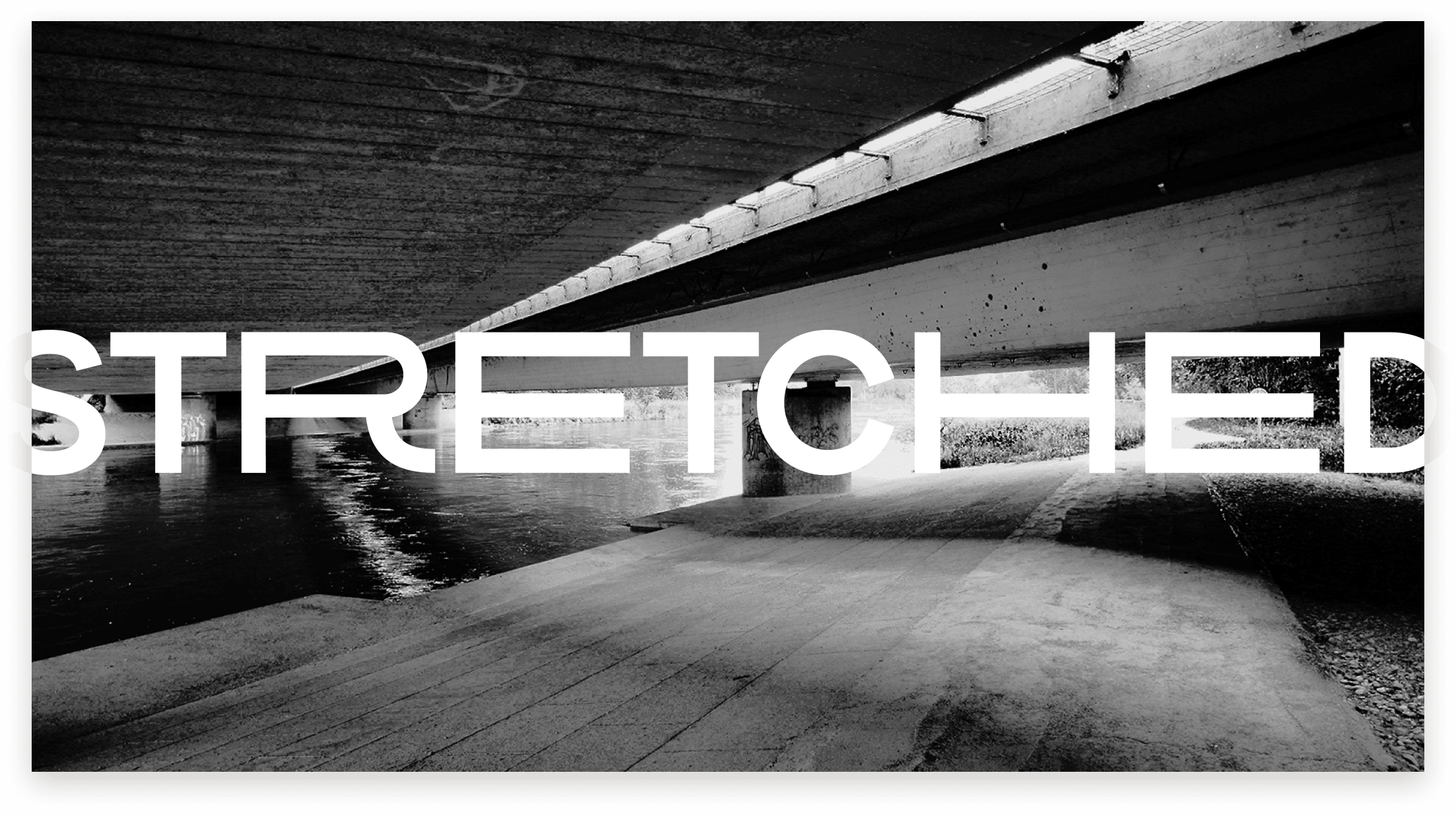
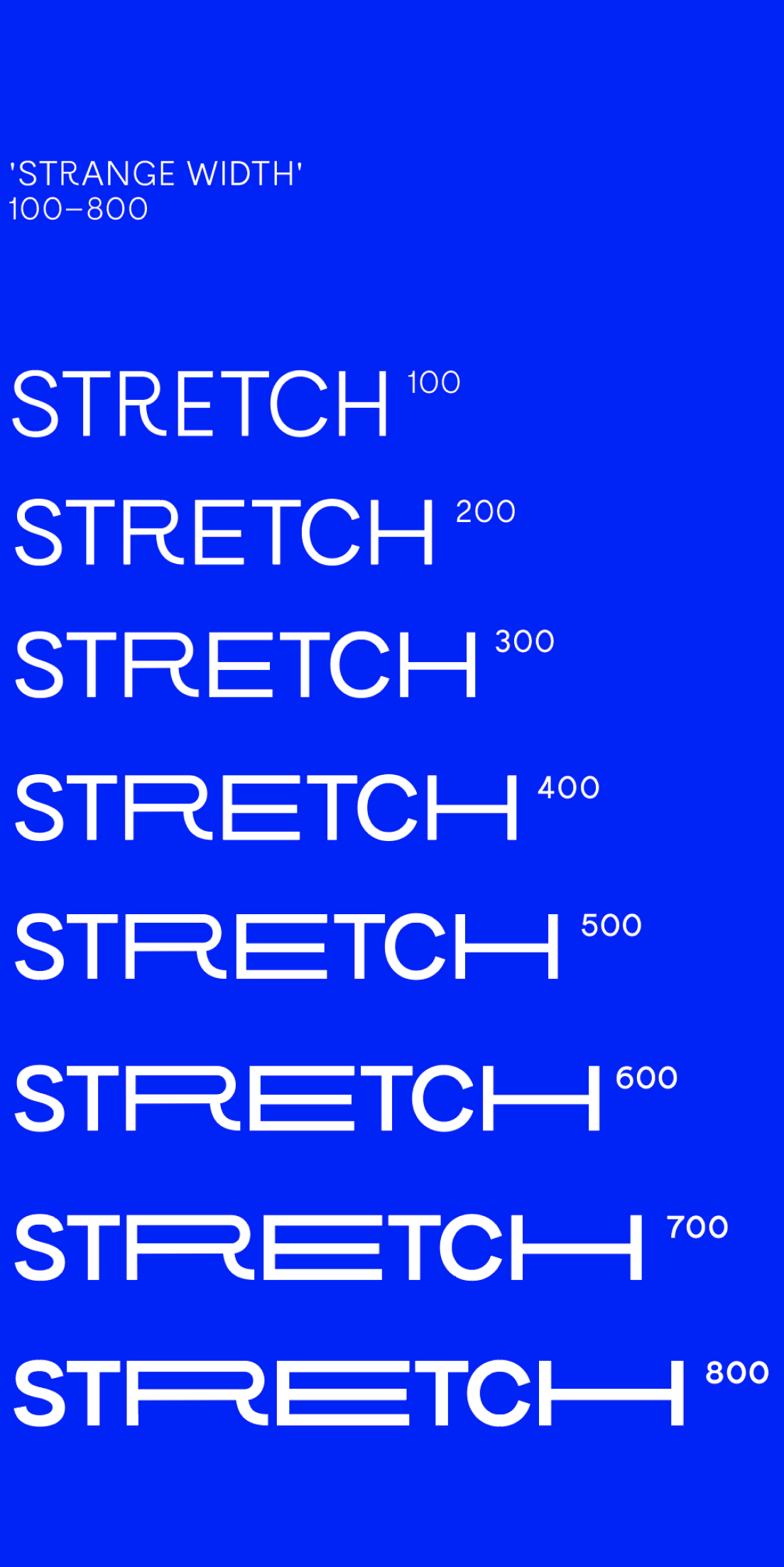
Bandeins Strange is a variable font which means it can change dimensions dynamically, rather than pre-defined in steps like a typical typeface. For most variable fonts that means you can alter the weight fluidly, but Bandeins Strange also includes a ‘strange width’ which allows some letterforms to stretch horizontally with 800 unique variations.
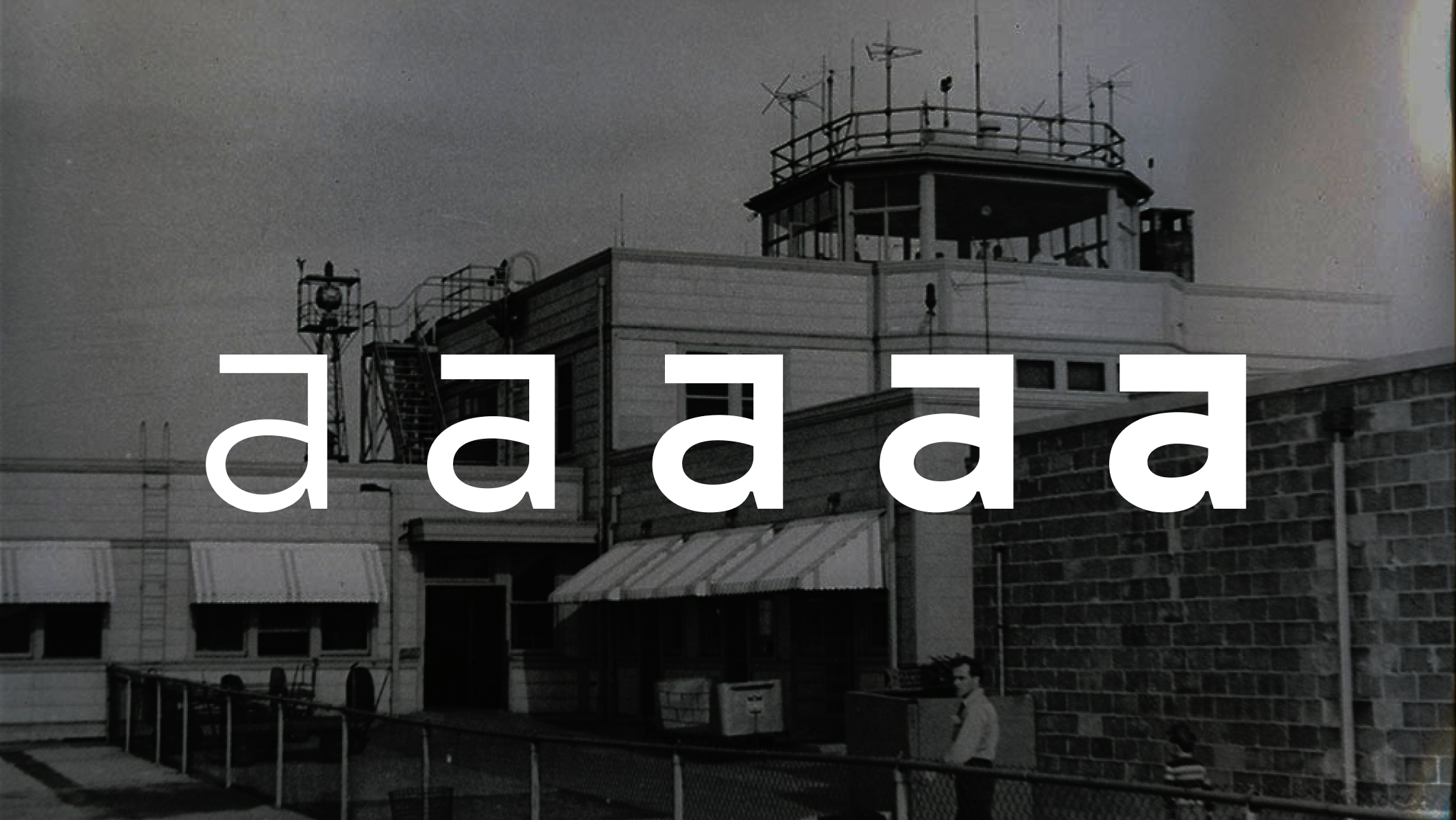
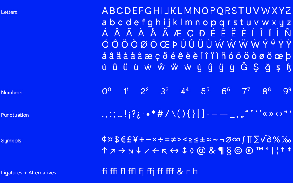
Bandeins Strange is a modern sans serif typeface that reverses curves and edges, creating a harmonious but also strange impression that gives the font a unique character. Some letters have a sharp and flat appearance, most apparent on the a, g, t, r and y characters.

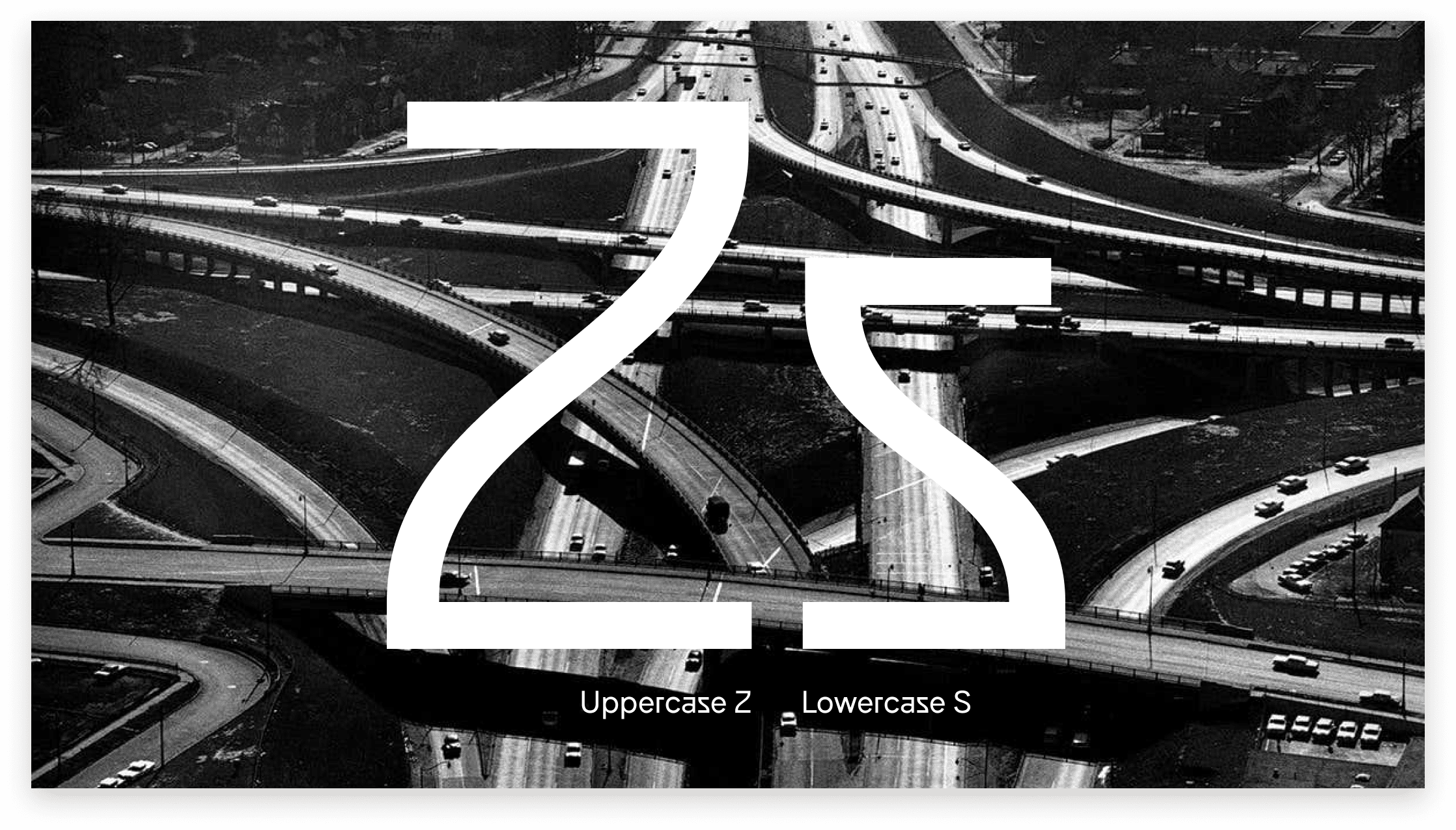
The Strange typeface is a sibling to the more traditional 'Bandeins' typeface that reverses curves of some letters, giving a stranger appearance. For example, the lowercase S is reversed, twisted and cuts off sharply at the edges – almost like a highway exit.
If you don’t opt to use the variable version of Bandeins Strange, the font also includes a set of 5 predefined weights and 3 different styles: Regular, Half extended, and Full extended.


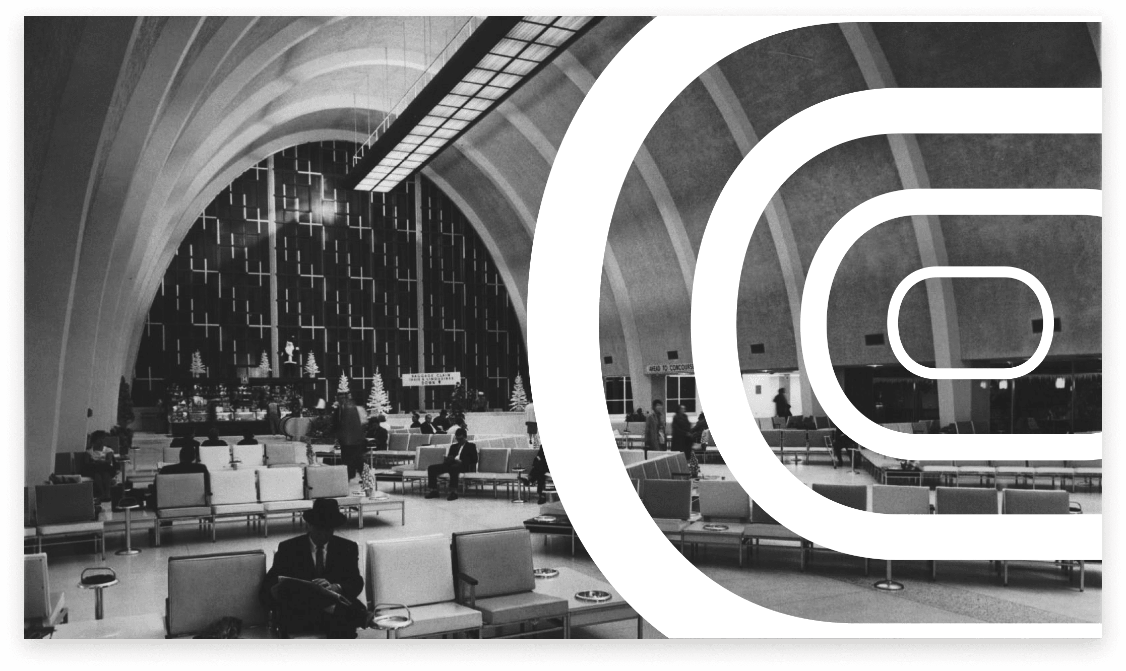
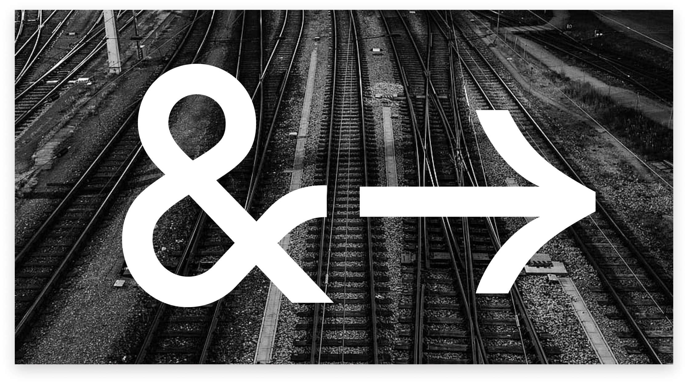
The style of the font seems perfectly suited for languages like Russian or German where letterforms are naturally hard and sharp, even in generic sans serif typefaces. Bandeins Strange feels like it would be at home in a soviet airport or a train station in frankfurt.



Maximilian Müsgens
Type designer from Germany, Aachen
Bandeins strange was designed by Maximilian Müzgenz for his type foundry: format.otf (originally Type-1) who are based in Germany. It was released in 2019 and was created digitally, for use on the web as a variable typeface. Bandeins strange can also can be used for print as a typical .ttf or .otf font file, with 5 weights and 3 selected ‘strange width’ styles.
Available for purchase (120€) at:
www.formatpunktotf.de See in AR