Ihumātao poster – Citizen designer

This week at uni we analyzed images as a class and tried to decipher the style the artist has used to get their message across 'rhetorical devices.' What I found more interesting from this lecture was the idea of 'Citizen designer' and Fay put it nicely at the end of our lecture: "Some designers get paid to design, others design to do something meaningful in the world and spark an idea." For example one poster we looked at was shepherd fairey's "HOPE" poster for the Obama campaign and the backstory behind Shepherd actually approaching them, not the other way around which I thought was pretty awesome.
Throughout the class we were working on Proverbs, but I couldn't get the idea of Citizen designer out of my head – the previous night as part of my research I was watching the news and learnt about the peaceful protests going on in Auckland where there's disputes over land which is owned historically by Māori but was seized and is now owned by Fletcher's building company. I tried to do research afterwards about it, but couldn't find any good sources for learning about the history of the land, and why it was so important to Māori. I asked everyone at the start of class as a group if anyone else was watching and knows the history behind the situation and I learnt more about it – to me it seemed like such an injustice and inequality, and one that was happening *as we sat there in class*.
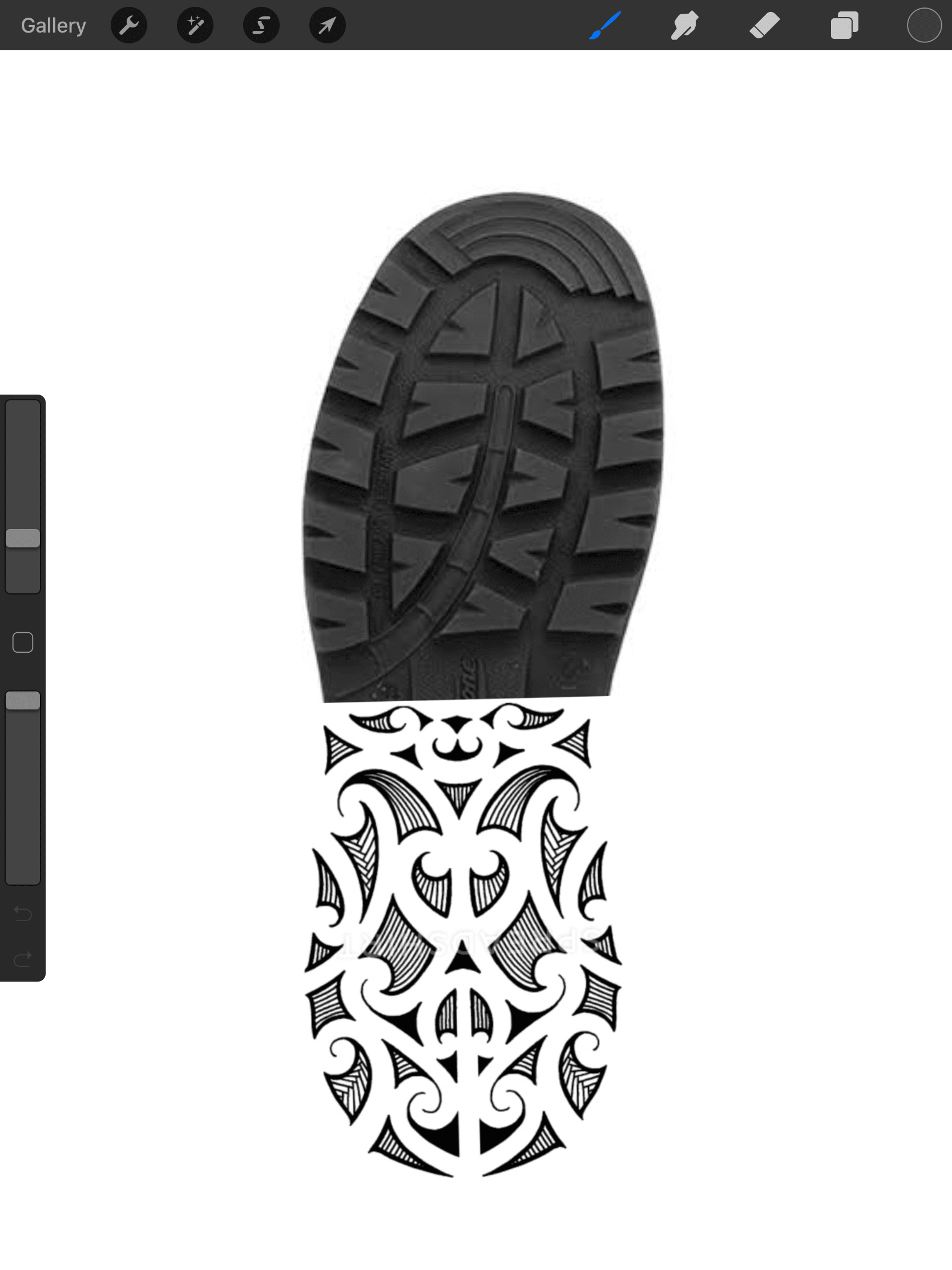
I wanted to do something about it, so I did a couple exercises of the proverbs but couldn't get Ihumātao out of my head. I thought of some ideas that I could pursue, and ending up liking the idea of boot prints the grassy landscape – showing the police and Fletchers making marks on sacred land without any respect – but I wanted to put a twist on it and try juxtaposition by having Maori symbols on the boot – much like one of the previous posters we saw of the tire – which would also make it so that the viewer would have to piece the two things together to make the connection.
Topic research "in the field" on instagram – looking at protesters attitudes and signage & messaging.


From here I explored combining the image with typography – I remember seeing posters by Thomas Le Bas after the Christchurch shooting earlier this year. To me, the type really evoked a personality and deeper meaning, so I wanted to explore that with my posters.


In the final poster I included some subtext I saw across my research into inequality and land ownership & colonization. I'm extremely happy with the final poster and think it speaks to both the idea of the viewer having to make their own connections with the piece, juxtaposition and solid wording (thanks to protestor signage) all together makes a great citizen designer piece of work. Really glad we covered that in our lecture today.