Interim posters


I tried playing with the idea of a repeated man silhouette with one stand out woman jumping in the air, but it was hard to get what I was looking for, so I moved on. I found the above poster by amnesty international and loved the idea behind it and thought it would translate really well to the whole repeated johns idea. The poster in the top right is what I settled on for one of my interim concepts – I like how simple it, while still having a super strong message, as if the suit is the corporation and the suit is made of johns.


One of the words I wrote down this week after our exercise in class was skyscraper, because I feel that emphasizes CEOs and corporations really well for people, it's a good metaphor. One thing I explored early on was cross sections, as a kid I adored Richard scarry picture books where you can see the inner workings of a factory or ship, and once I saw some of the photographs of silhouettes it instantly reminded me of them. It made me think what if instead of regular people, I used silhouettes of men in suits in corporate office building, and there was only one woman silhouette
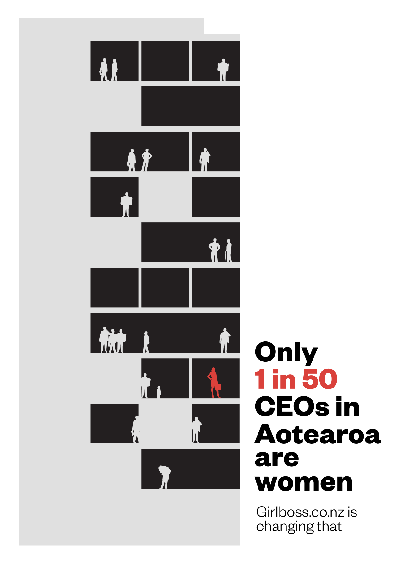
I think this poster is my favorite, I feel like the Wehi is strong – as a viewer you can imagine yourself as the woman is a whole building full of men, and the quote really backs that up. The quote is based on the NZX50 where the only female is the CEO of Chourus. I also like it for the Richard scarry reasons I mentioned earlier.


Final throne poster – pretty happy with this but would like to develop it at some point, I think it could be better because right now the message isn't really clear. The Ihi is the throne at the top of the company is reserved for John, but I'm not sure the Wehi will strike the same way.

Tried different typographic layouts and I was pretty happy with the last one (bottom right) but it felt a bit flat and boring. Originally I went for the theme of a word find but thought this was nicer looking. My only struggle with it is that it doesn't really relate to business, but I'm not convinced that's actually 100% necessary anyway.

In the end, I found a great image of men at a football game, and used them as an image behind the text to give more of an emotive feeling to this poster, which – until I did it – I thought of as my weakest. I actually really quite like how this one turned out – it's a bit different to the flatness of the others, it's more textural and dynamic.